Sur.ly Blog
How To Keep Visitors On Your Website Longer?
 by
Sur.ly Team
on
| News And Analytics
It comes as no surprise that every website owner who worked day and night to build his/her project is always in search of ‘holy grail’ trying to invent a better way to retain visitors, get people interested, focused on the site’s content, and then straightforwardly converted into sales or sale leads.
You may call it in a variety of ways: user retention, engagement, conversion or bounce rate (depending on a purpose you’d like to stress out), but it’s always about the ability to keep users on a site long enough to influence their opinion, behaviour, or convince them of doing certain actions, such as subscribe to newsletter, join the site, buy from it, etc.
8-second ‘goldfish’ attention span – is it true or false?
First of all, we’d like to take part in busting the eight-second attention span myth (aka ‘goldfish attention’ myth) which was widely replicated by many reputed media outlets. It seems that there is no solid evidence that human attentions spans are shrinking every year (and it has nothing to do with goldfishes), but your website still has somewhat from 50 ms to 17 ms (milliseconds!) to produce a good first impression forming a user’s opinion on whether they like it or not, whether they’ll stay for more or go away immediately.

In other words, keeping people on your site is not about fitting into their attention span, but about your ability to form a positive first impression, as well as communicate your message/values/ideas in a nonverbal way (don’t worry, it’s easier than it sounds).
A number of studies have proven that:
- First impression is mainly design-related (main image, logo, etc).
- Well-crafted design looks credible and thus attracts people to stay.
- Unpleasant design makes people go away very fast.
- Inspiration-related main images (i.e. visualization of a user’s goals or dreams) call to positive emotions and thus work the best.
- No problem with scrolling: people do scroll when they’re interested, so not only the page’s ‘above the fold’ area needs to be well-designed and impressive, but the rest of the article (‘below the fold’ area) too.
Web design is a castle and content is king!
We at Sur.ly strongly believe that success in grabbing a user’s attention and holding on to it for as long as possible includes four evergreen components to be constantly improved:
- Make your message crystal-clear and comprehensive.
- Add eye-catching visual elements.
- Play ‘social approvement’ game.
- Provide users with convenient routes (links) to travel around your site for more content with ease.
The last one includes a special recipe from Sur.ly that may significantly change your conception of outbound linking. But let’s start from the top…
Improve the text till it’s a feast for the eyes
No doubt catching the attention of your visitors is hard without a well-structured text in place. Nobody loves to read massive, uninterrupted, poorly edited text blocks, and most likely visitors will leave such a page without even starting to read (good for them!), despite all its potentially ingenious content.
The golden rule is: keep your ideas clear, the message short, and the text streamlined.
Make sure your text is well-structured, optimized, and thus easy to read:
- Divide text in short paragraphs (2-5 sentences).
- Divide the whole text in sections/chunks/blocks with <h2> subtitles.
- Use lists and step-by-step plans where possible.
- Keep the font size big enough for easy reading.
Power your content up with multimedia
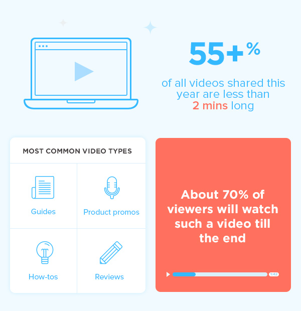
Well-made video content is a perfect way to catch the attention of new visitors as well as to entertain your regular followers. Slide presentations or self-explanatory infographics can hit the mark too when it comes to keeping users focused and engaged (also, the process of making a slideshow is a bit easier and cheaper in comparison to video).
Creating visuals is pretty easy and popular nowadays: although the process still involves some creativity, there is no more need to be IT-savvy – owing to lots of user-friendly video making software and services out there, it may require just basic technical skills (not to mention video sharing services that let you easily embed videos within any page in a matter of minutes).
Just a few evergreen video ideas to refresh your mind:
- Product reviews
- Company announcements
- How-to guides
- Product walkthroughs
- Customer stories and testimonials
- Interviews
And just a few workable tips to follow:
- Keep your video length optimal: most of the videos with the best user engagement are about 2 mins long or less (this study covering relation between video length and user engagement proves: the longer a video is, the lower its retention rate).
- Do your best to prepare an action and narrative script: a pointless, unemotional or just poorly structured video may look boring, and thus it can scare the potential clients away.
- Consider including some auto-play fragments (without sound and maybe with captions) into a page’s layout – intriguing motion previews will surely draw user attention.

Add comments: drama and engagement won’t be long
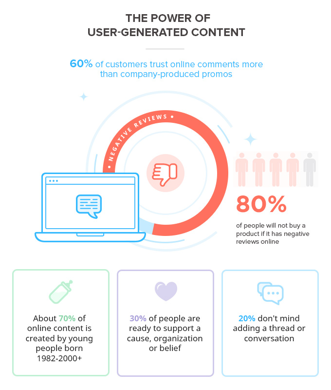
People love sharing their thoughts, opinions, and personal experience! Give it a go: improve your pages by adding a comment section, and ask users to express themselves.
Remember that there are many people who read just the beginning of an article and then scroll it down right to the bottom of the page searching for comments, as the ‘social approval’ factor is a good reason for them to finish reading the piece (aren’t you one of that kind?).
- Ask users to leave comments in relation to the article’s subject or to suggest alternative solutions of their choice, and thus encourage online discussions.
- Be a little bit provocative, so you can raise an argument among users and watch further comments grow like a snowball.
- Do your best to foster intelligent conversation and debate, but moderate comments as needed.
- If you have a considerable number of social media followers, then bring the social widgets forward.

New comments might attract even more users to join the conversation, increase the value of your page with additional info, cause frequent content updating which is important for Google-friendly SEO approach, and of course, keep visitors on your page longer reading and commenting.
Link internally and… externally too!
Internal linking between your site’s pages is a positive SEO factor too, but it should be done in the most user-friendly way possible, so people may readily surf through your content.
If you have several posts related to a certain topic (and visitors find your material interesting enough to continue reading), you’d better let readers know about them by offering multiple content options just in the right place:
- Place related links organically within your text.
- Provide some kind of article previews (but stay accurate with sidebars, as sites without sidebars may have a better user retention rate and thus grow better).
- Build a neat navigation panel for comfortable surfing throughout your website (comprehensive menus, categories, tags, etc).
Another solution, which is not on the surface, is adding user retention tools to your OUTBOUND links. Here comes a dilemma: such links can contribute to a higher bounce rate (as users may escape through them), but those links are still good for your SEO!
Should we just accept the fact that users may leave? Not with Sur.ly!
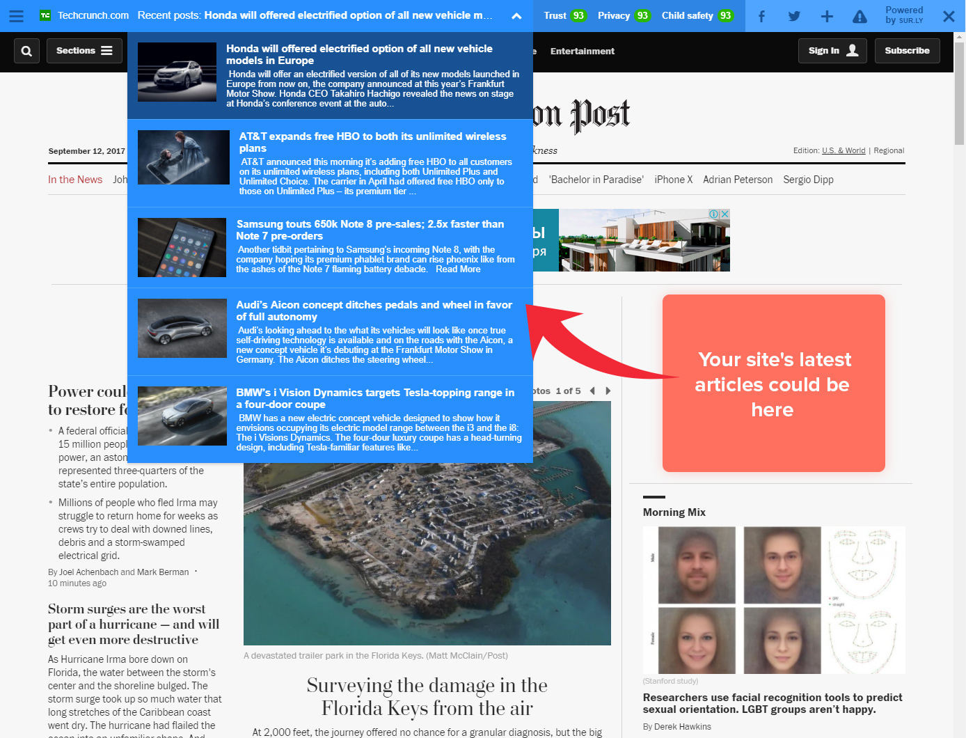
Sur.ly plugin will add a toolbar showing your site’s navigation panel and latest articles at the top of every external page that visitors may go to from your pages (including user-generated links in comments, forum or your native blog posts).

As you can see it extends your site’s area of influence far beyond its immediate pages, and helps you recapture users (convince them of returning to your site for more great stuff) even while they are in the process of surfing away via outbound links.
A few more takeaways on how to keep users longer
- Involve people into a direct conversation/messaging to answer their questions with the help of live-chat invitations (but make sure they are not too obtrusive and easy to dismiss).
- Add a search bar. Often people come to a site trying to address their issues, so let them search and spend more time on the site.
- Offer free giveaways from time to time – it’s always a worthy investment that can make people keep an eye on your site updates (you may call it a brand loyalty).
Recent posts
How To Identify And Neutralize Phishing Attacks
posted onEveryone who often deals with the Web has ever heard the term ‘phishing attack’. Today we will explain what a phishing attack is, reveal its mechanisms, and give you effective tips on how to recognize and rebuff any phishing attempts.
Sur.ly Surfguard is here!
posted onSur.ly Surfguard is here! It’s a browser addition powered by our web safety platform, which lets you preview status of a link before clicking on it. If a link is unsafe, you’ll get a pop-up notification when hovering your mouse over it.
I am not a robot: How to stop human-generated fake user registrations on any platform
posted onIf you run a free membership site of any kind, then you surely have a first-hand experience of dealing with spam signups. Such fake registrations are a pure garbage that adds no value to your user base, ruins the overall picture of your audience, and can do no good to any marketing efforts: the more […]